
On the Visual History of the Illithid
How does the Dungeons and Dragons Monster depiction change through time? There was some question about this recently and it seemed like a quite interesting subject. I'm no art critic, though I do have a Bachelor's Degree in Art, so I'm not completely out of my wheelhouse. Imma just gonna give my opinions. You got different ones? Share 'em! Let's take a look.Mind Flayer (Illithid)
 |
| First image of a Mind Flayer |
 |
| Monster Manual (1977) |
Here we see a number of interesting features, a large head with very wide eyes containing pupils, a high collar rich looking robe, with a skull hanging from the harness.
It's important to note that artistically, everything we're going to be looking at is fundamentally illustrative. These images are designed as tools, rather then their point being a work of art.
Not that they can't be both.
It's important to note that artistically, everything we're going to be looking at is fundamentally illustrative. These images are designed as tools, rather then their point being a work of art.
Not that they can't be both.

This creature was inspired by the cover of the paperback edition of The Burrowers Beneath by Brian Lumley, a Cthulhu Mythos story. so from the book image below, we get the creature illustrated to the above.
I find the use of an irregular octogon surrounding the Mind Flayer to be an interesting artifact. Although several creatures in the monster manual have boarders, most are square. Only two other creatures, the Bugbear and Type V demons have Octogonal borders and both of their borders are more regular. Each pane of the Mind Flayer Border is of a different length, no two matching.
Also, that robe is hella-baggy. Apparently fashion shows in the underdark have the burlap sack-dress as the height of fashion. This explains why drow women usually eschew the dress and just wear the harness.
 |
| Rogues Gallery, Erol Otus |
 This image of a mind flayer from S2, Expedition to the Barrier Peaks Illustration book 1980, continues the pupil-less eyes. This is missing the characteristic high collared robe, trading it in for "futuristic space clothing". Here we see the first definition of the body of the mind flayer, which appears to be a very fit, very thin man who spends a lot of time at the gym doing squats to look good in his spandex future-clothes.
 |
| Dragon Magazine #72 |
 |
| D1 Descent into the Depths |
 |
| Monster Compendium |
Second Edition
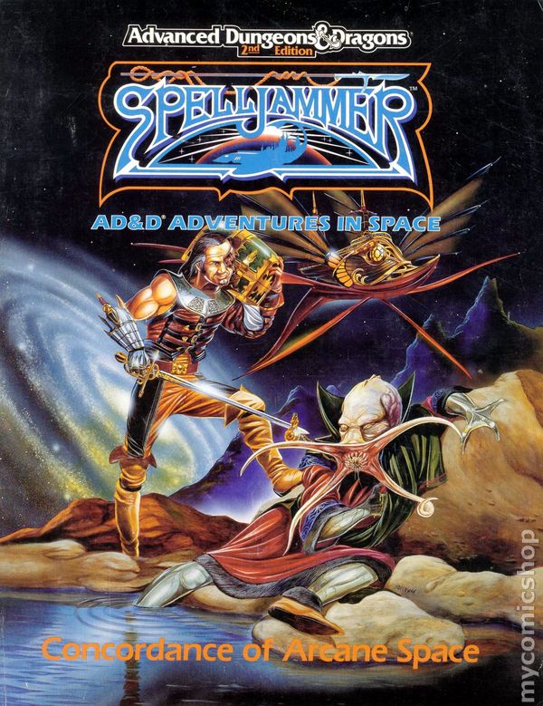
Once Second Edition is released, there's a bizarre divide in the depiction of the Mind Flayer. With the release of the new monster compendium, there's a depiction of a mind flayer with a beggars robe and some dapper hat with a red tassel. A beak is visible in the middle of his spread tentacles and his eyes appear as round hook like objects. Also, his robe is over a striped dress and he is wearing a pair of zori. On the other hand, the same year that image was released, Dragon Magazine ran an article on the home world of the mind flayers, called the sunset world. This presents a radically different image of mind flayers then had been previously seen. These creatures look like they are wearing gas mask helmets, and their head and collar resembles some sort of elephantine beast. They lack the requisite skull dangling from the neck, but in spite of all the plants on their homeworld being black, they somehow manage to make those stylish tweed robes.
Illithids at this point become both more common and more "cool" due to a certain scimitar wielding elf and his connection with the underdark, and images of these creatures exploded in popularity, from settings such as Spelljammer (1989) to the Illithiad (1998) late in the section edition run. As is common in the second edition run, the fantasy became more "grounded" in the fantastic realism phase of fantasy art, driven primarily from the influence of Elmore's consummate work near the start of the period, Dragonslayers and Proud of it.
 |
| Some color, indicating a pale pink skin color. They continue to have an obsession with garish fashion. |
 |
| From the Illithiad. Sweet pants bro. |
 |
| Fred Fields Illithiad Cover |
The whole composition says brain, from the halo around the brain to the fact that everyone is either pointing to the brain or looking at it. It's at the apex of the triangular composition.
MIND FLAYERS ARE ABOUT BRAINS.
It also makes them look like guys who got beat up in school, which I think is why immediately after you flip the cover they turn back into octopuses on really thin and fit scrawny bodies. (skinny guys fight till they're burger.)

At the point of this publication, there were an explosion of interpretations of illithids. Here's an example by James Crabtree of an expressionistic hulking beast, coming out of some whole to eat you.
It's nice because both the body and the face appear to be threatening, as in some large hideous brain eating creature, instead of looking like something that's going to talk like the architect from the second matrix movie. This looks like it's going to rip your head off and not move like a bad special effect. The dissonant alien colors (yellow/blue) increase the feeling of unease, and in general form it resembles someone in a deep-see diving uniform, calling back to what an experience in the underdark should be like.
That said, it isn't very mindflayerish.
 This illustration on the left, also from the illithiad found in a section called "Performance Eating" is lurid like spanking comics of the 20th century. It's roughly done, dehumanizing to the woman and emphasizing the horror and helplessness of some creature that feeds not just on your flesh, but also on your brain!
The illustration also implies the true horror of what the creature is doing, as not only is it sharing the experience of eating the brain with the faceless innumerable illithid audience behind him, but also the thralls who must not only watch but experience the horror of brain eating for themselves.
 |
| Check out my sweet flute |
3rd Edition

Moving on to the Dungeon-Punk aesthetic of third edition, we get our new mind flayer design in the Dungeons and Dragons 3.0 Monster Manual.
Apparently this mind flayer has some tailor thralls, because the clothing is starting to fit the actual form of the creature. In true Dungeon-Punk style, we get lots of chains, pointy bits, and bandages on the creature.
It's at this point in the historical deception that the color blue and purple begins to be strongly associated with Mind Flayers. Compare above to the pinkish skin tones with the blueish-purple used in this picture and the ones following from books like Lords of Madness.
 |
| Lords of Madness Cover and Interior art by Wayne England and Ed Cox |
 |
| Elder Brain |


Note that although these illustrations have become all in full color and a lot more detailed then previous illustrations, there moving in the general form towards being more boring.
Above, in first and second edition you have examples of strange alien like creatures, bug swarms, lazers and Illithids in space suits, some guy playing a bizzare musical instrument, an illithid in space being disarmed by a treasure carrying pirate.
Once we reach third edition, it's illithid standing and putting a brain in a jar. Illithid standing. Illitihid casting a spell. Here's another example of an "Exciting" fight.

So, there's an "off-kilter" and "exciting" composition in some "dramatic" duel. And by no means is this a critique of Wayne Renyolds—more power to any artist that influences the design of Role-Playing Games for years and becomes the face of the gaming juggernaut that is Pathfinder.
But you can hear the camera shutter. It's just two dudes that don't like each other. It's not interesting in the sense that it makes me wonder what's happening in the picture and it's not interesting in the sense that I'm interested in the form and depiction of line and color. In the book it fills space and comes across as some sort of static noise. Even the exciting parts of the picture—the tail parts of the Illithid robe and the ponytails of the Gith seem static and uninteresting.
If you'll indulge me, I'll link two pieces by my favorite illustrator Russ Nicholson to make my point.
 |
| Interesting Combat Pose |
 |
| Interesting Static Pose |
In both of these pieces, there's tension and interest in every line. You can lose yourself in them a bit.
Back to the Mind Flayers.
4th Edition
 |
| These guys are starting a band—ARE YOU READY TO ROCK! |
In 4th edition, the mind flayers go full purple with their skin color and become anime battlemasters. This pose, in my humble opinion, makes them less threatening than any of the above options, because they are looking to fight me—and I know I can win a fight.
This 5th edition Mind flayer picture is an improvement, I'd say.
 |
| 5e Mind Flayer |
This 5th edition Mind flayer picture is an improvement, I'd say.

This post took forever and may be all I have time for this week. If you'd like to join the great group of folks making post like this possible and creating the time to have more things like this pop-up in your feed, visit my Patreon and help me get closer to the goal of a post every day of the week—We're over halfway there!
0 komentar: